Group 3 TWGSB
This is Group 3 of the TWGSB AS Level media studies Blog. The Group members involve Josh, Callum and Marcus.
Tuesday, 10 May 2011
Group: Navigation: Evaluation Posts
Josh:
Questions Individual
Marcus
Questions Individual
Callum
Questions Individual
Group Posts
Questions 4 & 5
Question 7
Links to our Productions:
Alteration
Preliminary Task
Storyboard
Questions Individual
Marcus
Questions Individual
Callum
Questions Individual
Group Posts
Questions 4 & 5
Question 7
Links to our Productions:
Alteration
Preliminary Task
Storyboard
Sunday, 8 May 2011
Group - Evaluation
The video below discusses what we feel as group we learnt from our Preliminary task, and how we incorporated our findings into our Opening sequence.
Saturday, 7 May 2011
Tuesday, 3 May 2011
CB- Evaluation
1.
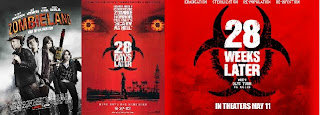
Throughout our film opening the typical conventions of horror can easily be seen through mise-en-scene, camera work, sound and editing. We did this so that we could easily portray our horror genre to the audience. We believed that using the typical conventions of horror would help the audience to easily establish the narrative. We aimed at the film opening attracting the core audience (16-24 age bracket) as similar films have done so, such as Zombieland (Fleischer, 2009).

The style of our film opening is similar to 28 Days Later (Boyle, 2002)and 28 Weeks Later (Fresnadillo, 2007), this can be seen through our montage at the beginning and titles which are red in colour, representing blood similar to 28 Days Later and other blood-like gore films.
Our character exposition is very important in the opening sequence; we used another typical convention of horror which put the character in a very isolated and ‘alone’ situation. This allowed the audience to see the point of view of the character in a frightening form. This idea was developed through the location of a deserted train station and walkthrough, set at night.
The camera work allowed us to create allowed us to create the form, putting the protagonist character in a vulnerable position, through close-ups and low angle shots we could portray this.
 2.
2.
Our film opening represented social groups through the position in th narrative, developing it through camera work, mise-en-scene, editing and sound.
The protagonist character, we aimed at looking around the age of 20-25years of age, intelligent, upper class and with a well paid job. We put him in a smart suit representing his job and upper class statue, clean and smart movements of the character and camera representing his clean and smart attitude.
The camera work and mise-en-scene allowed us to represent the protagonist, as well as the clean movements of the character we used low angles as he became vulnerable to represent the fear. However the mis-en-scene challenged the ideaology of this particular social group through location. The deserted location was put in to seem strange to the audience that an upper-class male would have to wlak in such a frightening area. This is another convention of horror, situating a particular social group in an eccentric area.
The other characters we used (zombies) we used were shown to be lower and middle class, we did this because we wanted the audience to easily relate to the characters involved in the narrative. No specific social group was portrayed so that it seemed every social group was represented in the norm. We represented these characters through the costume, dressed in low cost clothing, dirty and ripped tracksuits represented the lower classes.
3.
As our opening sequence appeals to the mass audience as our protagonist character is aimed at 20-25 years of age. Therefore along with the genre of our film which is horror we will be able to distribute this film to other multiplex’s cinemas. Along with this however we would have to be careful with the financial investment, as everyone knows horrors have a very little budget and distribution costs.
There are many companies that could distribute our film, Fox Search Light Pictures (parented by Fox) have distributed films such as 28 Days Later and 28 Weeks Later, which are both similar horrors to our film. This was also distributed to a similar market (American) and therefore could be very effective in this market. DreamWorks have also distributed horror films such as Paranormal activity which have been very successful in the American market and could distribute our independent film very strongly.
 6. Throughout our film opening and the creation of it I used many different technologies to help create the opening sequence and help its progress run smoothly. All the way through the planning, creating and evaluating of this film opening our group worked collaboratively to blog our updates. This kept very formal communication between us, allowing our ideas to be expressed in formal communication rather than kept in our minds. I learnt how to blog posts with images and videos on, helping progrees continue smoothly and efficiently.
The HD camera we used took some getting use to, as a group we went to 'Wilderness Woods' to experiment with the cameras, getting to grips with what we had to do. It helped me understand the framing of the shot, the mise-en-scene, composition and zoom. This allowed us to get first hand what needed to be in the shot and how we could make it effective.
Moreover the 'Adobe Premiere' editing software was very helpful in creating an effective film opening. Although it took quite a while to understand all the 'ins and outs' i soon got the hang of it and was able to help fit together some continuity editing and the 'ALTERATION' title at the end. This in turn, again allowed me to express my ideas and put them into practice, although some ideas were poor, others were very effective and were used in the film opening. For example the 'blinking' effect at the end of the clip.
Throughout our film opening the typical conventions of horror can easily be seen through mise-en-scene, camera work, sound and editing. We did this so that we could easily portray our horror genre to the audience. We believed that using the typical conventions of horror would help the audience to easily establish the narrative. We aimed at the film opening attracting the core audience (16-24 age bracket) as similar films have done so, such as Zombieland (Fleischer, 2009).

The style of our film opening is similar to 28 Days Later (Boyle, 2002)and 28 Weeks Later (Fresnadillo, 2007), this can be seen through our montage at the beginning and titles which are red in colour, representing blood similar to 28 Days Later and other blood-like gore films.
Our character exposition is very important in the opening sequence; we used another typical convention of horror which put the character in a very isolated and ‘alone’ situation. This allowed the audience to see the point of view of the character in a frightening form. This idea was developed through the location of a deserted train station and walkthrough, set at night.
The camera work allowed us to create allowed us to create the form, putting the protagonist character in a vulnerable position, through close-ups and low angle shots we could portray this.
 2.
2.Our film opening represented social groups through the position in th narrative, developing it through camera work, mise-en-scene, editing and sound.
The protagonist character, we aimed at looking around the age of 20-25years of age, intelligent, upper class and with a well paid job. We put him in a smart suit representing his job and upper class statue, clean and smart movements of the character and camera representing his clean and smart attitude.
The camera work and mise-en-scene allowed us to represent the protagonist, as well as the clean movements of the character we used low angles as he became vulnerable to represent the fear. However the mis-en-scene challenged the ideaology of this particular social group through location. The deserted location was put in to seem strange to the audience that an upper-class male would have to wlak in such a frightening area. This is another convention of horror, situating a particular social group in an eccentric area.
The other characters we used (zombies) we used were shown to be lower and middle class, we did this because we wanted the audience to easily relate to the characters involved in the narrative. No specific social group was portrayed so that it seemed every social group was represented in the norm. We represented these characters through the costume, dressed in low cost clothing, dirty and ripped tracksuits represented the lower classes.
3.
As our opening sequence appeals to the mass audience as our protagonist character is aimed at 20-25 years of age. Therefore along with the genre of our film which is horror we will be able to distribute this film to other multiplex’s cinemas. Along with this however we would have to be careful with the financial investment, as everyone knows horrors have a very little budget and distribution costs.
There are many companies that could distribute our film, Fox Search Light Pictures (parented by Fox) have distributed films such as 28 Days Later and 28 Weeks Later, which are both similar horrors to our film. This was also distributed to a similar market (American) and therefore could be very effective in this market. DreamWorks have also distributed horror films such as Paranormal activity which have been very successful in the American market and could distribute our independent film very strongly.
 6. Throughout our film opening and the creation of it I used many different technologies to help create the opening sequence and help its progress run smoothly. All the way through the planning, creating and evaluating of this film opening our group worked collaboratively to blog our updates. This kept very formal communication between us, allowing our ideas to be expressed in formal communication rather than kept in our minds. I learnt how to blog posts with images and videos on, helping progrees continue smoothly and efficiently.
The HD camera we used took some getting use to, as a group we went to 'Wilderness Woods' to experiment with the cameras, getting to grips with what we had to do. It helped me understand the framing of the shot, the mise-en-scene, composition and zoom. This allowed us to get first hand what needed to be in the shot and how we could make it effective.
Moreover the 'Adobe Premiere' editing software was very helpful in creating an effective film opening. Although it took quite a while to understand all the 'ins and outs' i soon got the hang of it and was able to help fit together some continuity editing and the 'ALTERATION' title at the end. This in turn, again allowed me to express my ideas and put them into practice, although some ideas were poor, others were very effective and were used in the film opening. For example the 'blinking' effect at the end of the clip.

Monday, 2 May 2011
JM - Evaluation
In what ways does your media product use, develop or challenge forms and conventions of real media products?
From the first stages of our project we began to research a variety of horror film openings, particularly Zombie Horror. From this research we took the typical conventions shown throughout, such as the conventions of typography, mise-ene-scene and soundtrack. As a group we undertook Audience Research which also improved our understanding of the conventions to be expected in the horror genre. We constructed our film opening according to our research.
Possible the biggest finding of our research, is that many of the modern Zombie horror films in many ways take a sarcastic view on the genre. One of the foremost conventions that achieves this is the soundtrack. Many Zombie Horror openings begin with a high paced rock song, such as ‘Zombieland’ (Fleischer, 2009) which has ‘For whom the bell tolls’ by Metallica throughout the opening sequence, in contrast to horror films which choose slowly paced songs which are often minor key.
Another typical convention shown in many Zombie horror films is the typography. We learnt that the font and effect on the font can often immediately inform the audience of the genre. We noticed that many of the fonts had been chosen and given an affect which gives them a blood like appearance. Furthermore nearly all of the fonts were red. As a group we chose a font with the appearance of blood, similar to that in ’28 Days Later’ (Boyle 2002). Our typography can therefore be said to use similar font conventions to many other horror films.
Also conventional of horror is a glooming light throughout. We decided to develop this convention with a mixture of day time shots, at the beginning of the sequence, progressing quickly into night at the end of the opening. We achieved this by specifically timing our film days and adjusting the saturation, contrast and brightness, both on the camera and post production in our editing software, Adobe Premier. These techniques, alongside our chosen locations created the ‘gloom’ light throughout. Particularly the tunnel shots of a our opening sequence were successful in achieving this, shown below.
Considering our camera techniques and editing, we tried to use a variety of shots and angles, rather than concentrating on specific show, however we attempted to use numerous point-of-view shots, as they are typical of horror sequences. We wanted to achieve this as it puts the audience in the characters position, given the chaotic effect.
How does your media product represent particular social groups?
It is difficult to comment on particular social representations within our opening sequence as the audience can only relate to one character. This is the 16-25 year old businessman protagonist character. We chose this character as it appeals to the largest target audience, and we therefore felt that this age was most suitable.
Possibly the biggest way our opening sequence represents a social group is the costume and props of our character. The aim was represent the protagonist as a smartly dressed male, this is typical of many 16-25 year olds working in the city, who take pride in their appearance. We achieved this through Suit and tie costume. Furthemore the choice of a male as the protagonist character within a Zombie Horror is typical of the genre. Nevertheless is it common that the victim of the horror storyline in female, due to the idea of vunerablility, we however used a male. The victim being a male in many ways challenges the typical horror conventions.
Furthermore we also aimed to represent the teenage audience at the beginning of the opening sequence. Many teenagers are keen in modern technologies, in order for the audience to feel related to the character; we gave the protagonist a prop. The protagonist was listening to an IPOD on the train, this was at the beginning of the opening and therefore the audience can quickly relate to the character, and therefore increasingly emphasise for the situation the protagonist find himself in later.
For one of our Zombie characters, we chose to represent a lower class male. This decision was made as male lower class are often used in films to represent violence and aggression. We achieved this by the costume of the charcater, a Hoodie and Tracksuit bottoms. Many people throughout society recongise the hoodie as a sign of hostility and aggression, we therefore felt that this choice was particularly successfully in representing a Zombie character.
What kind of media institution might distribute your media product and why?
Our opening sequence, as we planned, should appeal to a mass audience due to a combination of factors. These being the age and gender of our protagonist character, male 20-25, which often appeals to the masses, and that our film is not culturally specific. It should therefore has potential to be distributed to multiplex cinemas such as Cineplex. I believe that we are not restricted by our, small independent production status, should not restrict our investment from large distribution companies such as Columbia Pictures, under Sony Pictures, as our film is aimed at such a wide audience, this being the 15-25 year old audience.
A possible company to distribute our film, which has shown interest in the Zombie Horror genre in previous years , could be Fox Search Light pictures. The parent company Fox, distributed both ’28 Days Later’ (Boyle, 2002) and ’28 Weeks Later’ (Fresnadillo, 2009) to the American market, showing the company’s interest in the Zombie horror genre. Having a large conglomerate such as this, would allow our independent production to benefit from the marketing advantages the conglomerates have available, which would increase the buzz factor for the film’s release.
What have you learnt about technologies from the process of constructing this product?
Throughout the whole process of constructing our opening sequence, we have been recording stage by stage our processes on ‘Blogger’. This proved to be a successful piece of software, as it allowed us to easily and quickly record and comment on the process of our opening sequence.
For our film shooting we used a Panasonic HD camera and used a tripod to ensure smooth shooting and camera movements. We have a variety of shots where the protagonist character runs past the camera, the Tripod allowed us to do this and help to keep the camera in the same place.
Perhaps the biggest hurdle for me personally would be the use and understanding of the Editing software, Adobe Premier. I began the editing by uploading the footage onto the computer, and then importing it in the Premier software. Importantly I did not wait for our group to complete the footage in order to finish shooting, as I believed this was wasted time. This meant that after every shoot, I would upload the previous day’s footage onto the computer. The first stage of editing involved organising the footage into order. Thirdly, began the task of cutting down the footage, and compression of time. The majority of this stage was spent ensure the montage at the beginning of the sequence was cut perfectly. The next stage involved adjusting the brightness and saturation of the footage. This was an important stage as we wanted to achieve a specific time frame, and lighting throughout.
In the montage at the beginning of the sequence, we added a technique called strobe which involved putting white and black flashes within and between the shots. This in many ways was the hardest technique to achieve as it was very time consuming and the timing of the flashes was particularly important.
The final stage of our editing was to add titles and transitions. For this we used a black screen between specific shots, and then adding the ‘Your Murderer’ font with red colouring. We then added the ‘fade in’ and 'fade out' motion so they dissolved from and to next sequence. We made sure the text was cut to the footage so it ran smoothly and looked professional.
After the time consuming stage of editing, we finally exported our opening sequence. Other than the skills learnt in the Editing stage, as a group we particularly learnt the importance of large amounts footage needed. This allows the person editing, to pick the best shots. Furthermore we changed numerous pieces and idea we originally planned to shot and edit, as they proved to be difficult and time consuming. When comparing our plans to our outcome production, I believe that the biggest problem we faced as a group was the lighting. Our aim was to progress from the light of day to the darkness of night, however the technology we had available to us, specifically lighting equipment, this was extremely hard to achieve.
MM - Evaluation Draft
Q1 - In what ways does your media product use, develops or challenge forms and conventions of real media products?
- The form of our opening, I believe is conventional, the techniques we have used for example the montage at the beginning and titles were inspired by ‘28 days later’ directed in 2002, by Danny Boyle. We wanted the font of our titles to be in red just to emphasis the blood and to carry on using horror conventions. The plot is set around a normal 20-year-old male protagonist who works and lives in England. As he gets the train home from work people are starting to mutate into zombies, luckily he hasn’t caught the virus, yet. So he will have to try and get away. I believe that the plot line shows a clear horror film, which follows the conventions.
- We were influenced by a number of zombie’s films and even looked at a video game ‘Call of Duty 4’ which gave us an idea that we have used in our actual opening sequence, which was the blinking technique towards the end. We also wanted the blood that we would use in the film to be vibrant like in zombieland.
- Still 1 and 2 (see powerpoint at the bottom of this post)
- We chose to do a horror film, because our group were all interested in it, and we thought that the characteristics and the conventions would be easier to follow than a thriller or a teen movie, we also thought that it would be easier to create enigma. However we didn’t want to just follow a normal zombie film we wanted to integrate our own unique aspect to the film, we did so by looking around the genre and using different and interesting techniques such as canted angle and the tunnel location.
- We decided to have the character to act normal and dress ordinary so that the audience could relate to the film, to show that the main character is not special he is just like everyone else. We also chose for our protagonist to be a male instead of a female because our target audience will be mostly male from around that age, so we wanted the majority of the audience to also relate with him. We noticed in our research that a lot of horror movies use quite a few hand held shots, so we experimented with it and found that it was very effective and made it feel fast and intense, which looked really good. Some of the other shots look very grainy like film noir, which we had looked at before, which gave a rough element to the clip. The editing creates a fast cutting rate at certain point, which makes it exciting and engages the audience. We looked at a few examples for the typography including ‘Seven directed in 1995 by David Fincher’ we liked how it looked and noticed that handwritten is effective. But we wanted a more conventional font so we found one on a website that we all liked. The titles with the black background anchor the storyline that we wanted to portray. We decided to put the titles on a black background to keep the mood dark and sinister.
- Still 3 and 4
- We had three main locations in this clip, the train, the platform, and the tunnel. The train is iconic in the way that as we see it coming into the platform it is like it is bringing the virus with it. It also tells us about the character that he is middle class and works far away. The tunnel gives a sense of darkness and is very mysterious; the audience will also feel trapped like the protagonist, I think it also corresponds with horror conventions.
- Still 5
- The soundtrack we used was a 'Blackout by Unkle', we were going to use a 'Muse' song but towards the end we decided it did not go with the theme as well as the new song. The song went well with our opening clip as the music is quite strange and repetitive. We changed the volume through out the clip according to what was being shown, which made it more thrilling as it got louder. We also used non-diagetic sound, for example the heart beat effect at the end, which injects pathos into the audience.
- We and most of the audience can only judge our sequence against big blockbusters because that is what the majority of us view, but what you have to consider is this was our first time making a opening clip of a film, our budget was around 10 pounds, we had never used the equipment or software before, and none of our group do drama or acting. Whereas all the big films, have millions of pounds for their budget, professional actors and actresses and trained professional for editing, camera and sound.
- Still 6
Q2 - How does your media product represent particular social groups?
- The only social group in our film opening storyline would be young white male. I have mentioned one reason why we chose a male stock character rather than a female. Another reason is due to gender traits, we wanted a male because stereotypically men are stronger, and we wanted a strong character. ‘I am legend directed in 2007 by Francis Lawrence’ is a prime example of a strong male protagonist; we wanted a character that later in the film would fight back instead of surrendering.
- We chose a white ethnic person, as the majority of victims in horror films are white, also of main target audience will be from the same ethic background.
- Our main character is represented positively and makes the audience side with him because they can picture themselves in that position as they are of the same ethnic background. It reinforces social norms, as the protagonist is just a normal guy in an abnormal situation. His costume also reinforces social representations, as it is common.
- The non-verbal language both reinforces and challenges gender stereotypes. The worried expressions on the protagonist face challenges the stereotype because men are suppose to be strong, then the character pushes the mutated person over on the platform which is masculine and reinforces the stereotype.
- Still 7
- Mise en scene, the train and the tunnel are quite normal but with the lighting in the tunnel make it menacing and scary. Also the tunnel and the fences give a sense of the character being trapped.
- Still 8
- Sound the soundtrack goes really well with genre as I have said before. The non-diagetic sound, for example the heavy breathing and heart beat can be see to represent traditional gender position showing the desperation in the protagonist as he takes his last breathes.
- Camera work, i don't think can very easily imitate social groups. They just reflect convectional horror techniques. The point of view shots especially, it also connects the audience as they are seeing what is happening through the actor’s eyes. Plus it reinforces character exposition, helping to get the audience on the protagonist’s side.
Q3 - What kind of media institution might distribute your media product and why?
- When our film is made the production company will have to secure a distribution deal offering a percentage of the box office and DVD sales. The distributors will then invest in designing the marketing, such as the posters, trailers and print copies of the film, and distribute to the chosen cinemas. We will then have to define our target audience, one that we want the distributor to focus on, we believe the target audience to be aged between 16-24 both males and females and a range of people from different ethnic backgrounds. We believe that the film will be especially popular with people in the age group of 16-21, and estimate that the majority of people that go will be in this age group. The target audience will have to be looked at in greater detail but that is the outline at the moment. Then the distributors will need to decide on how much to invest on promoting our film ‘Alteration’ whether we decide to exhibit worldwide, nationally, or to target a mass audience in cinema chains like ‘Odeon’, ‘Showcase Cinemas’ and ‘Apollo Cinemas’. Or to target a niche market showing in small independent screens such as ‘Picture House’ and ‘Trinity’. This could be the one for us, as costs would be lower than exhibiting nationally, and we would be able to focus on the small audience.
- Still 9
- Personally I think our film should target a niche audience and for opening weekend only show the film on 3 or 4 screens, then after we have established our self then we can distribute to bigger cinema chains like ‘Odeon’, they will be more interested and eager to show our film after seeing the opening weekend figures than taking the risk on a film that potentially could lose them money. ‘Monsters’ 2010 directed by Gareth Edwards did a similar thing, and only showed their film to 3 screens over there opening weekend. I think ‘Vertigo Films’ would be an appropriate company to distribute our film, as they are a British company so they will know the audience well. They have won numerous awards such as Audience Award – Gen Art Film Festival – 2005 and Most Promising Newcomer – Evening Standard British Film Awards – 2007. They have been the distributor for ‘The Football Factory’ which made over half a million pounds in the UK.
- Still 10
Q4/5 - Who would be the audience for your media product? How did you attract/address your audience? For this question as it is a group question, we will be making a powerpoint to answer the question.
Q6 - What have you learnt about technologies from the process of constructing this product?
- Firstly, we have obtained all of our work, research, and everything we have done in this process collaboratively on this blog. Each member of the group has been assigned tasks through out this course, all of our posts have been commented on by other members to show how well we have communicated and taken ideas onboard.
- Still 11
- Following picking our three locations, the train, platform and tunnel we had to think about the different kinds of shots we would want to include. We made risk assessments each time we had a shoot to reduce potential risks and to make us more aware. We filmed all of our footage on a high definition digital camera that the school provided; they also supplied a tripod, which was very helpful with creating smooth shots, for certain shots for instance the establishing shot. The weather was the main problem for us, as it is unpredictable. If it was raining we could not film and we had to postpone some shoots. We wanted to film at twilight, which limited us to the time we had for each shot. Some of the shots we had to think about the 180-degree rule and not getting the camera, equipment, or shadows in the shot. Most of shots went well, we just wanted to try out different techniques to see which ones were best. I learnt that it’s a very time consuming process and a lot of thought is needed.
- We didn’t have many problems with shooting, only a few minor issues such as getting the right depth of field and composition, particularly allowing space for the titles we wanted to include. Apart from a few other problems everything went well. We exported all of our footage into Premiere, then looked at and picked out the shots we would use in our final piece.
- Still 12
- We carefully edited the footage we had picked out, compressed time, and made the cut rate the speed we wanted.
- We had to have a quick cutting rate for the montage at the start so that some of the shots didnt drag on and set the pace slow at the beginning. The montage anchors the genre by being strange and disjointed.
- Still 13
- The blinking effect at the end, when the zombies are running at the protagonist, looks very effective but is done by a very easy editing technique, we just put a black screen in 3 / 4 intervals on the time line, so it looks like the actor is blinking in a dazed state.
- Still 14
- The final shot really brings in the audience, and they want to watch more of the film as the opening sequence ends.
- After we had done all the editing, we just had the titles to fit in, three of them with our names on them and the other the title of our film ‘Alteration’. We finally did a couple of last minute changes with the soundtrack and editing, and we had our opening sequence.
- Still 15
- The sequence was now done, we then had to export it, and we used external hardware to get the piece from Premiere to the teacher. We have not yet uploaded the clip onto Youtube but we will in the near future.
- Still 16
- Comparing our own production process with a real film production, I think with the resources we had and not a lot of knowledge in this area, I believe we made a successful opening sequence. It followed horror genre conventions and had our own unique influence incorporated into it. Obviously it’s not up to the same standard as a real film, but the people we have showed it to were very impressed with our first effort.
- I have learnt a great deal during the process of making an opening sequence for a film. One of the biggest things that shocked me was the number of shoots that had to be done and the amount of footage that was needed. I thought we would be able to finish the footage in one shot, I was very wrong. We learned a lot about the equipment and the camcorder, things like pull focus that can we done on the camera itself. I have also learnt lots of technical terms that I didn’t know before, for instance, fade, dissolve, depth of field, rule of thirds and saturation.
Q7 Looking back at your preliminary task, what do you feel you have learnt in the progression from it to the full product? This is another group question, this time will be using a video to answer the question.
http://www.youtube.com/watch?v=ZhEgtUx6Hg4
Powerpoint of stills
Subscribe to:
Comments (Atom)


